Mandates vs Single Payer

Let me ask fellow conservatives a question: Would you be in favor of replacing single-payer education with the individual mandate (aka, school vouchers)? Or reforming single-payer Social Security with an individual mandate to save (meaning, you *own* your retirement savings, can bequeath them to your children, can choose to move it to companies giving a higher yield, etc.) Because as a conservative I’m all for that.

The Republican party has done both its members and its mission a disservice by spending the past few years speaking out against the healthcare mandate as some form of liberal conspiracy, when in fact it is a conservative position invented by conservatives. The party has been putting the short-term interest of eliminating Obama over the long-term best interests of citizens. And I say that as someone who ran for public office as a Republican, so I’m not doing myself any favors by pointing it out, I’m just being honest.

Healthcare, education, and a few other fields simply do not obey the same laws of economics as oranges and iPods. Your lifetime earnings aren’t going to be seriously dented if you don’t get an XBox. You aren’t going to die if you don’t get a pair of Nike’s in time. This isn’t some kind of controversial position (except to politicians who find facts inconvenient). It’s been standard knowledge in freshman economics textbooks for decades.

Here’s reality: with healthcare costs projected to climb for decades, and with insurance companies increasingly booting people to avoid having to pay, *some* form of healthcare reform was inevitable. You can either go individual mandate, or single payer.  There is no 3rd option.  So if the individual mandate were struck down, we would have been ultimately left with single-payer healthcare, and you can see how good single-payer has been for education and retirement.

Education can primarily be judged by a) quality and b) cost. But measuring quality is hard and takes years, while measuring cost is much quicker and easier. Given that, in a single-payer system politicians often cut quality because the consequences won’t be evident until they’re out of office tomorrow, whereas raising taxes or cutting services gets voters riled up today. That’s one of the reasons why America’s education system has dropped to 25th in the world, behind such intellectual heavyweights as Latvia and the Slovak Republic.

An individual mandate preserves your freedom of choice. It only requires that you do something instead of nothing. We require kids get an education, whether public, private, or home school. You don’t have the right to *not* educate your kids because uneducated kids are a burden both on themselves and on others. Uninsured people impose similar costs.

And that is key to understanding why the pure free market solution doesn’t work.  If you don’t buy an XBox, it doesn’t affect me.  If you don’t educate your kids, or don’t buy insurance and end up sick, your failure *does* affect me, because my taxes have to pay for it when your kid goes to jail or you go to the hospital.

Having said all that, I prefer a mandate in the form of HSA’s and catastrophic insurance, but the anger conservatives have towards this is irrational, and seems to derive more from a dislike of Obama than a sober deliberation of the policy itself. It’s a “cut your nose off to spite your face” reaction.

Posted in Uncategorized | Leave a comment

Signs and Portents

Note:  I actually wrote this May 11, but neglected to publish it because I was thinking about adding a few more things and eventually got side-tracked by some research I was doing on Cheatham County.   Unfortunately, my predictions seem to be panning out.   If only I understood women as well…

Since I began writing this, CNN came out with their “Fear and Greed index”, which does what I was trying to do, only much better, so give them a look.

My dad has been hectoring me to predict the mood of the market so he can rebalance his retirement portfolio.  After doing some research, I’m not an optimist about the next 6 months.

Bad sign #1:  Personal income growth is slowing

The ECRI reports that the growth rate in personal income (the blue line) has slowed to 0%.  The income growth rate is very strongly to economic conditions.   You can see that a sharp downturn in the growth rate often presages a recession.

Bad sign #2:  Stock sales by insiders near decade peak

CNN reports that stock sales by insiders (CEO’s and directors at companies) are the highest in 10 years.   While CEO’s are still publicly forecasting good times, their stock sales tell a different story.   Why sell your stock today, if you honestly believed your company’s stock was going to be worth more in 6 months?

Bad sign #3:  Price of oil drops 10% in a week

The price of oil may be going down because the market believes the chance of armed conflict with Iran is diminishing.  That would be good, because lower gas prices would help stimulate the economy.

Unfortunately, what I’ve read is that the price dropped because of decreased demand due to slowing economies in China, India, and Europe.

(Probably) Bad sign #4:  The VIX index is rising

The VIX index measures volatility in the market.   Peaks in the VIX are usually correlated with market drops.  You can see it reached “bottom” in 2012, and is showing a slight uptrend towards the end.   That is signaling increased uncertainty about the immediate future.

Posted in Uncategorized | Leave a comment

Cheatham County Trends

A work in progress.   This will be updated from time to time.

Population

Cheatham County’s population growth (in blue) has been slowing for some time, and in recent years has grown slower than the Tennessee average (in red).

UTK’s Center for Business and Economic Research has created a spreadsheet of population forecasts for the next several decades that highlights that Cheatham County is suffering from an accelerating decline in population under 40.

They predict that the county population as a whole will continue to slowly grow around 1%.   However, the population under 40 (primarily young families with children) is forecast to plunge precipitously.   On average the county will be growing “older”.

This trend will devour the county’s seed corn of young families in just a few years unless halted.

The formula for population growth is:

Population growth = (births – deaths) + (in-migration – out-migration)

If we look at the actual data, we can see that net migration into the county collapsed in 2000.

There were 3 seminal events in that time period (that I can recall, anyway) that might be the cause:   The Dot.Com recession, the impact fee was raised from $750 to $7500, and AO Smith acquired State Industries.  (If there’s another candidate event I’m overlooking, please let me know!)

If it were the Dot.Com recession, it is reasonable to assume it would have have had similar effects on other surrounding counties.   However, their population growth recovered to varying degrees, while ours lagged behind, which suggests the causative factor is something intrinsic to Cheatham County.

This is still a bit speculative (I need to more research to conclusively prove it), but after trawling through a ton of data, a large portion of collapse in net migration appears to be due to the impact fee.  New home construction plummeted as soon as it was passed.

The impact fee caused the average home price after 1990 to to grow faster than before 1999, making buying a home a more expensive proposition and reducing the supply of affordable housing.

While the price of an average new home in Cheatham started growing faster in 2000, prices in Robertson and Montgomery counties were unaffected.

At the same time prices in Cheatham were starting to skyrocket, the average home price in Davidson actually dropped:

Since young families are often on a tight budget and can get more house for their dollar elsewhere, Cheatham lost out on growth to other counties, primarily Davidson.

Income and Employment

As you’ve probably noticed, we’re in the middle of an economic depression, similar in scope to the Great Depression of the 1930’s (although so far of lesser intensity).  The conditions that precipitated it are unlikely to disappear for some time.  The average Tennessean’s real income has yet to catch back up to what it was in 2007, much less where it should be, and there are currently more negative economic signs than positive on the horizon.

For years, the county (in blue) had lower-than-average unemployment, both compared to the rest of Tennessee (green) and the country as a whole (red).  That helped the county tremendously.   In good times people in Cheatham County had more jobs, and in bad times we lost fewer jobs.

This was probably due to State Industries’s growth providing an above-average supply of jobs, as well as selling something (hot water) which you have to have irregardless of how the economy was doing.  But you can see starting around 2000 the gap began to narrow, and effectively vanished when the Great Recession hit.

The local unemployment rate has caught up with the national unemployment rate since roughly 2007.  My hunch is that this is due to several factors:

  • AO Smith acquiring State Industries and sending growth out of the county to other plants.
  • As a large national company, AOS’s revenues are more strongly tied to the state of the national economy than the local economy.
  • Even beyond AOS, the trend towards globalization has diverted manufacturing jobs that would have come here to other locations.
  • New businesses are often reluctant to locate where unemployment is below-average, because competition for employees reduces profits.
  • Cheatham lacks fundamental infrastructure (broadband internet) needed to attract 21st century jobs like IT and healthcare.   Those jobs are gravitating to Davidson/Williamson instead.
  • Cheatham has been relatively unsuccessful at attracting new economic drivers.  Wal-Mart and Walgreens help, but they aren’t minting too many local millionaires.
Posted in Uncategorized | Leave a comment

Ugly truths and ugly lies

Trying to understand the economy is hard enough if you’re an actual economist.   But if your a normal person trying to filter through all the people who are just repeating the latest crazy they read on the Drudge Report and it can sometimes feel like a lost cause.

This is my attempt to poke holes in some of the uglier truths and lies I see in the news.

Ugly Truth #1:  Unemployment isn’t getting better

emratio
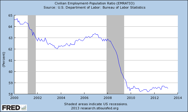
There are several ways to hide bad unemployment data under the rug (for instance, someone who has given up looking for a job is no longer considered unemployed for statistical purposes), so instead I look at employment since it’s harder to fake.

The graph shows that employment plummeted in the aftermath of the financial crisis in 2008, and hasn’t recovered an inch of territory in the past 4 years.

The population of the USA grows by 1% a year, so our economy has to add that many jobs every year (roughly 150k jobs per month) just to stand still.  The economy has only added 139k new jobs per month since the start of 2012.   You do the math.

Ugly Truth #2:  Our economy isn’t actually recovering

gdppot1

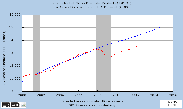
Compare the potential GDP of the country (what it would be if our factories and employees were all humming along at full capacity, in blue) vs actual GDP (in red).

GDP plunged sharply as the financial crisis unfolded.  In previous recessions, that gap closed quickly once the economy began picking up.   But not this time.   Either the gap is not closing at all, or at best will take years, possibly over a decade, to close at current rates.   And here is the cost:

gdppot2

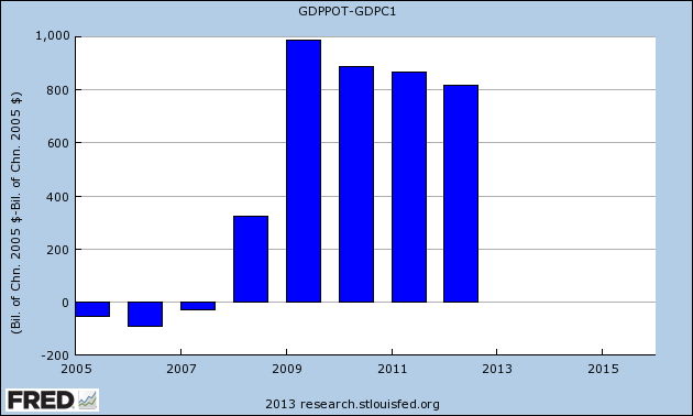
This bar graph shows how far below potential the economy has run.  $323 billion in 2008, $987 billion in 2009, $887 billion in 2010, $867 billion in 2011, and $817 billion in 2012.  That’s $3.9 trillion in wealth our country has foregone in 5 years.   In human terms, that’s $25,000 per household.

No one likes to see government borrow money to stimulate the economy.   But in the bad spot we’re in, it would have made much more financial sense to spend $2 trillion dollars on fiscal stimulus in 2008 to avoid losing over $3.8 trillion since then.

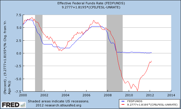
Ugly Truth #3:  Our economy isn’t out of danger yet

mankiw
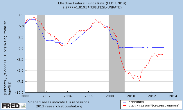
In normal recessions, the Federal Reserve lowers the Fed rate to banks, which makes it cheaper for businesses to borrow, which helps stimulate the economy and gets things moving again.

The problem is, the financial shock caused by the housing bubble bust was so huge, that the Fed would have to lower the interest rate below zero to stimulate the economy sufficiently.  But no one is going to loan you $100 this year, expecting to get $93 back the next year.  That’s what economists call the “zero bound”.

The above graph shows what the Fed fund rate is, versus what it *should* be to properly stimulate the economy (the “Mankiw rule”, using coefficients derived by Paul Krugman).  The red line delineates the economic hole we’ve been trying to extract ourselves from.  The economy has been trapped against the zero bound since 2008, and if we’re lucky we’ll escape the bound next year.

To a large degree, the zero bound is the defining difference between a mere recession and a depression.   The economy is more sensitive to bad news in a depression than in a recession.   Bad news that would simply slow down recovery in a recession can set off another catastrophic economic downturn in a depression.

So if we have a outburst of austerity, or Congress fails to extend the Bush tax cuts for people under $250k, or a conflict with Iran raises the cost of oil substantially, or Europe fails to get its economic crisis under control, or the real estate bubble in China pops, or any number of the things I can’t predict happen, and the economy will get worse, quicker than it would in normal times.

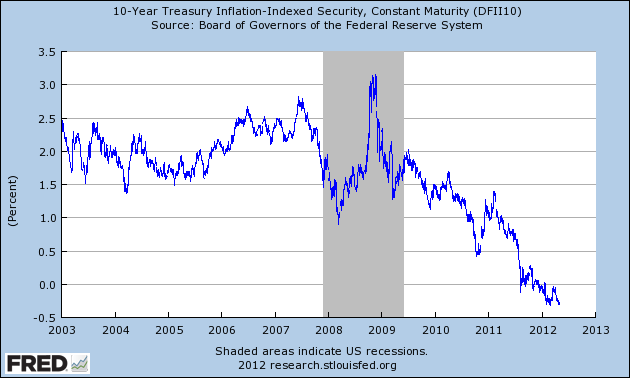
Ugly Lie #1:  The market is afraid that the government is borrowing too much.


If someone asked you for a loan, and you were afraid they couldn’t pay you back, you would increase the interest rate you charge them to compensate you for the additional risk you were taking.

The graph shows that the interest rate the market charges Uncle Sam on 10-year debt has been *decreasing* for a decade.  And after adjusting for inflation, today the market is actually *paying* the government 0.68% return a year (as of 5/4/2012) to borrow their money for 10 years.

The interest people earn is based on supply-and-demand.  If there’s a little money, and a lot of people want to borrow it, the lenders can charge a high interest rate.   If there’s a lot of money, and no one wants to borrow it, the interest rate can drop all the way to zero.

Plus, with all the uncertainty in the world, people are willing to leave a little money on the table in order to have their investments stored in something safe, and the USA is the best of a lot of bad choices.  That’s why the real interest rate is negative.

Rather than being afraid of government borrowing, the market is screaming, in flaming letters 50 stories high, “Please borrow *more* of our money so that the increased demand for money will raise the interest rates so we can get a decent return on our bonds and CD’s”.

Ugly Lie #2:  Inflation is out of control

cpilfesl

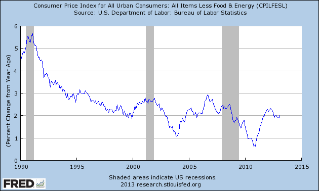
Inflation is actually well within its usual historical range of 2-3%.  Last year we were actually in danger of *deflation*.

People mistakenly believe inflation is causing prices to go up mostly due to three things:

1.  Supply-and-demand.   The price of oil is increasing because people in China and India and elsewhere desire the same comfortable life with cars and air conditioning that we have.   The problem is, the demand for oil is growing faster than the supply of oil.  Econ 101 tells you that means rising prices.  The price of food has gone up as well, partly because oil has gone up (oil is used to make fertilizer, drive tractors, and haul things to market) and because unusual patterns of drought and flooding killed an above-average number of crops in 2011.

2. Increased volatility.  Back in the 90’s when there was an oil disruption, we just asked the Saudis to open the spigot a little wider.   They had more than enough spare capacity.   But today they’re pumping all-out and don’t have any slack.  That means whenever Iran rattles its sabers and threatens war, the price goes up because the market knows there isn’t any spare capacity to cover up a disruption.   But it also means when the market calms, prices can drop quickly.

3.  Frequency bias.   People notice price changes in things they buy more often.  You buy food and gas twice a week, so when the price goes up you notice it quickly.   You buy a house every 20 years, so while the price of housing is still dropping like a rock, you don’t notice it.

Ugly Lie #3:  Obama has led to an unprecedented expansion in government

The graph shows the total number of federal, state, and local workers, graphed by month beginning with the president’s inauguration.   Government during Obama’s presidency has shrunk by nearly 3%.

While that might sound good to the conservative ear, the Wall Street Journal estimates that had those government jobs been preserved, unemployment would now be 7.1% instead of 8.1%.

Posted in Uncategorized | Leave a comment

Keynes vs austerity

You asked why I didn’t believe in Austrian economics. Both Austrian and the various schools of Keynesian economics make very specific testable, measurable predictions about the economy. If X occurs, then Y will happen.

Austrian economics predicts that austerity in a depression will help the economy. Keynes predicts that it will hurt the economy. Both the historical record of depressions going back several hundred years, and the ongoing turmoil in Europe show that austerity in a depression actually makes things worse.

If your theory of gravity predicts things fall up, and experimental testing shows things fall down, it means your theory is wrong, not reality. No matter how much you wish it was true.  God may care about your personal beliefs, but the universe doesn’t (and I’ve found that out the hard way several times).

The ancient Greeks tried to explain the motions of the stars and planets in the sky.  But they started from a incorrect proposition (everything revolves around the earth, and all heavenly objects moved on perfect spheres called epicycles).

When the predictions of this theory failed to match reality, they started adding epicycles on top of epicyles, instead of simply accepting that the underpinnings of their theory was wrong.

Austrian economics (as well as some other economic theories) have a difficult time explaining things like economics depressions because one of their core assumptions is incorrect: that a perfectly free economy is always self-correcting.

Most of the time, this is actually a valid assumption, but in the specific instance of a  depression the economy doesn’t correct itself, it undergoes a negative feedback loop (called a debt deflation spiral) that exponentially wipes out the economy unless it is arrested (see the Great Depression for a textbook example of this).

Since one of Austrian economics core assumptions is that the economy is *always* self-correcting, it has a hard time explaining instances when it *doesn’t* self-correct, and proponents end up having to invent epicycles (like saying “people are voluntarily choosing not to work”) that are at increasing odds to common sense, instead of revisiting their core assumptions.

Given Occam’s razor, I have to believe the theory that explains the most with the least, and today that is some flavor of Keynesianism.  That doesn’t mean Keynes is “correct”, any more than Einstein was “correct”.   It simply means Keynes’ theory makes more accurate and rational predictions than Austrian economics.  It doesn’t preclude something better than either of them coming along.

http://krugman.blogs.nytimes.com/2012/04/27/its-all-so-confusing

Posted in Uncategorized | 1 Comment